Blog
A new dashboard that’s more accessible
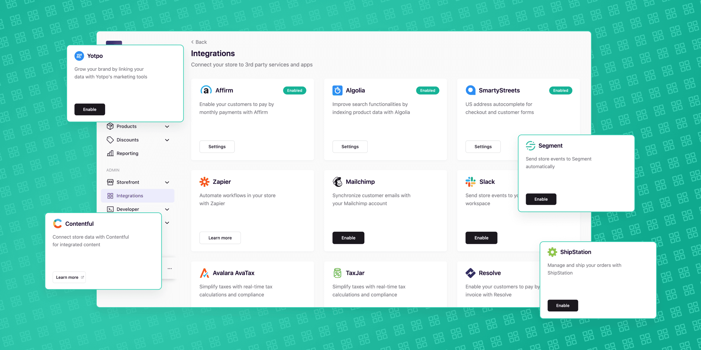
To give you the best possible platform UI we’ve launched a new and improved Swell dashboard. Same functionality, just better-looking.
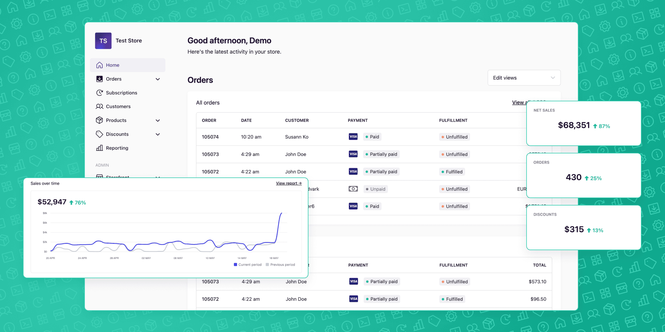
It's important that you enjoy the experience of running your store — and that’s where great design comes in. So we’ve refreshed the visuals of the Swell dashboard to make it easier to use than ever.
Swell's Head of Design Dave Loneragan and Senior Product Designer Aaron Lee walk us through the design process.
What does the new dashboard look like?
This new update is a visual overhaul to give the Swell dashboard a more modern look and feel.
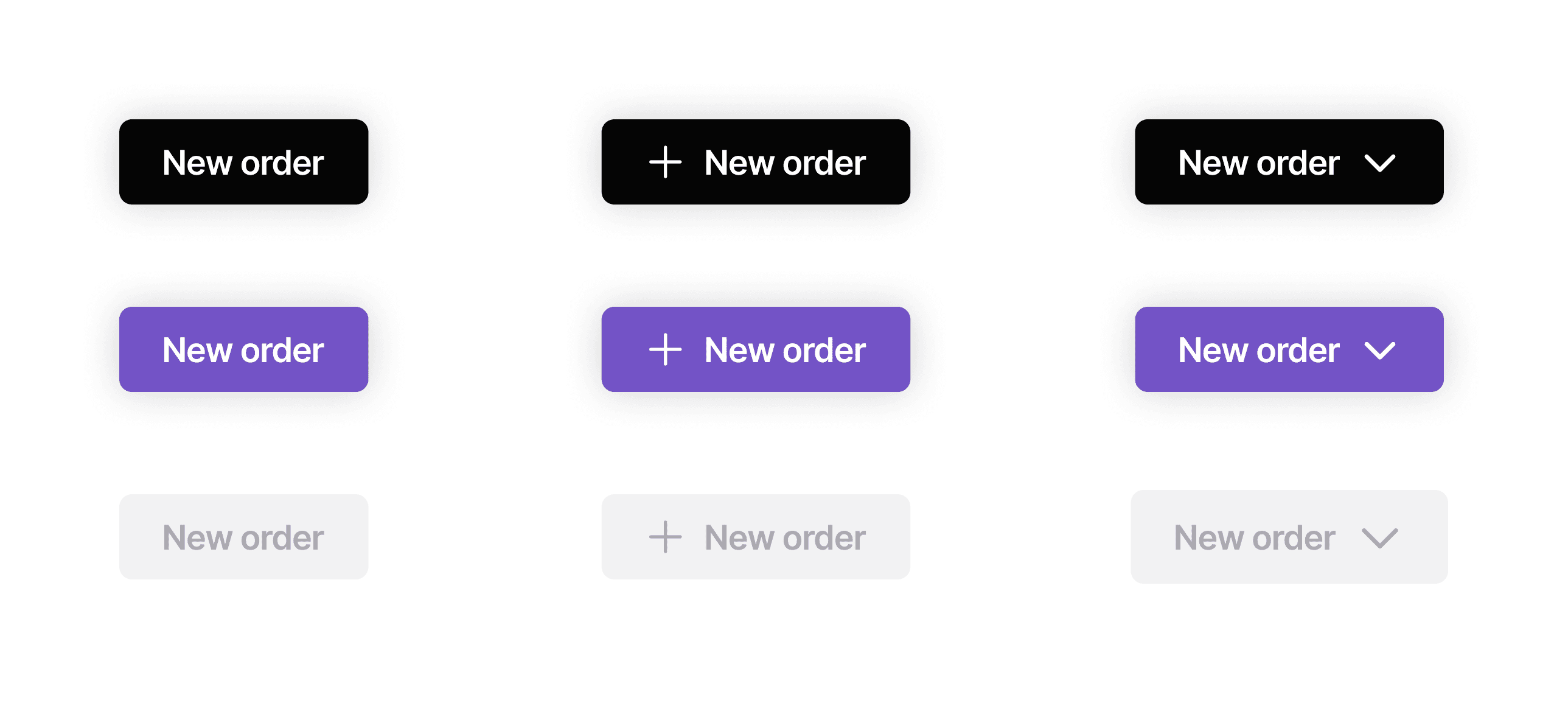
- Update the color system, buttons, and contrasts of our components.
- Make the library more accessible so that you can more easily build interfaces and features on our platform.
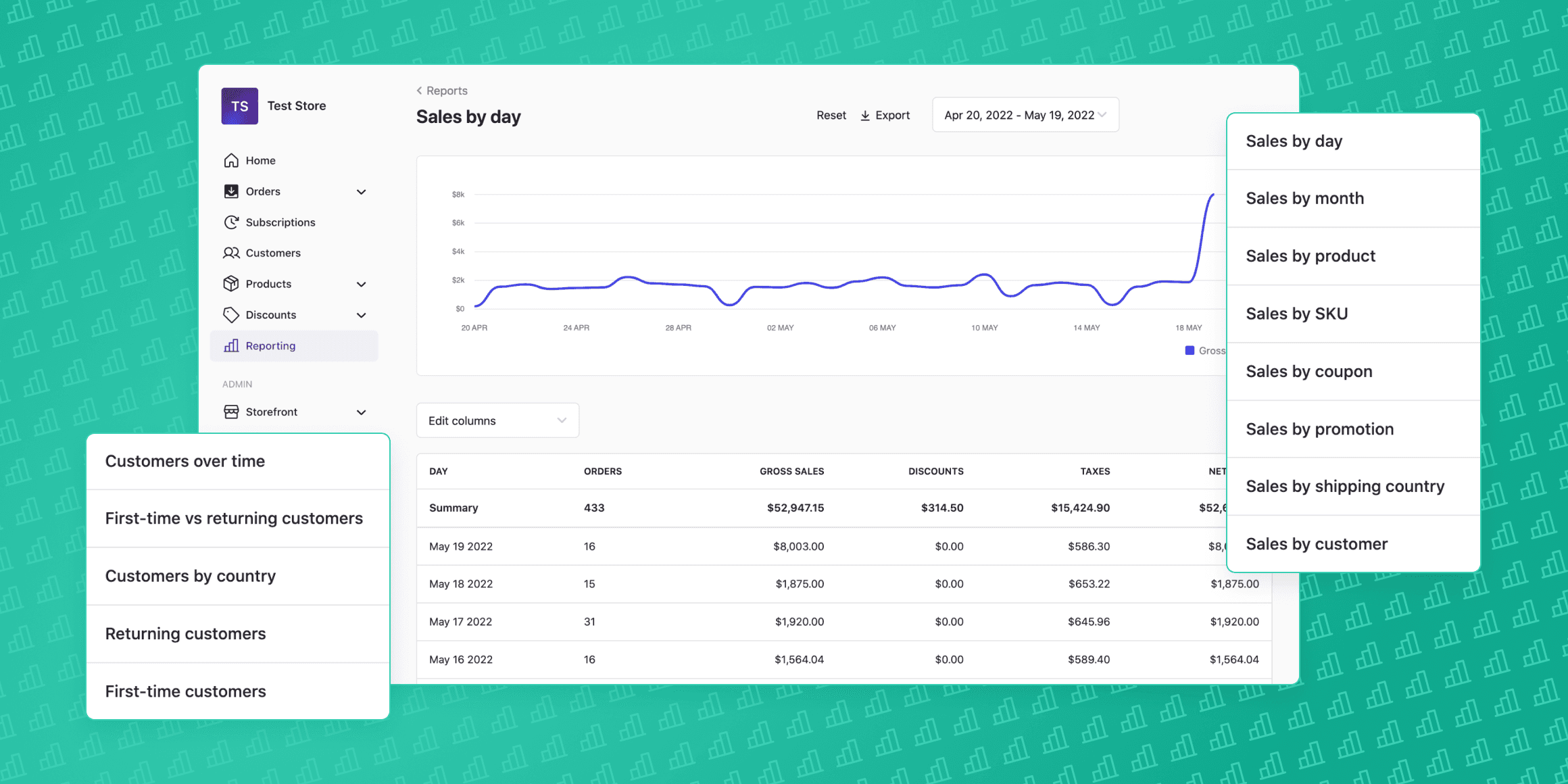
- Find the information a lot easier so that you can do things faster.
You will probably notice that the colors are more neutral and the Swell branding is toned down in this update. This is the first step in making the dashboard more adaptable to our merchant’s own branding and individual preferences.
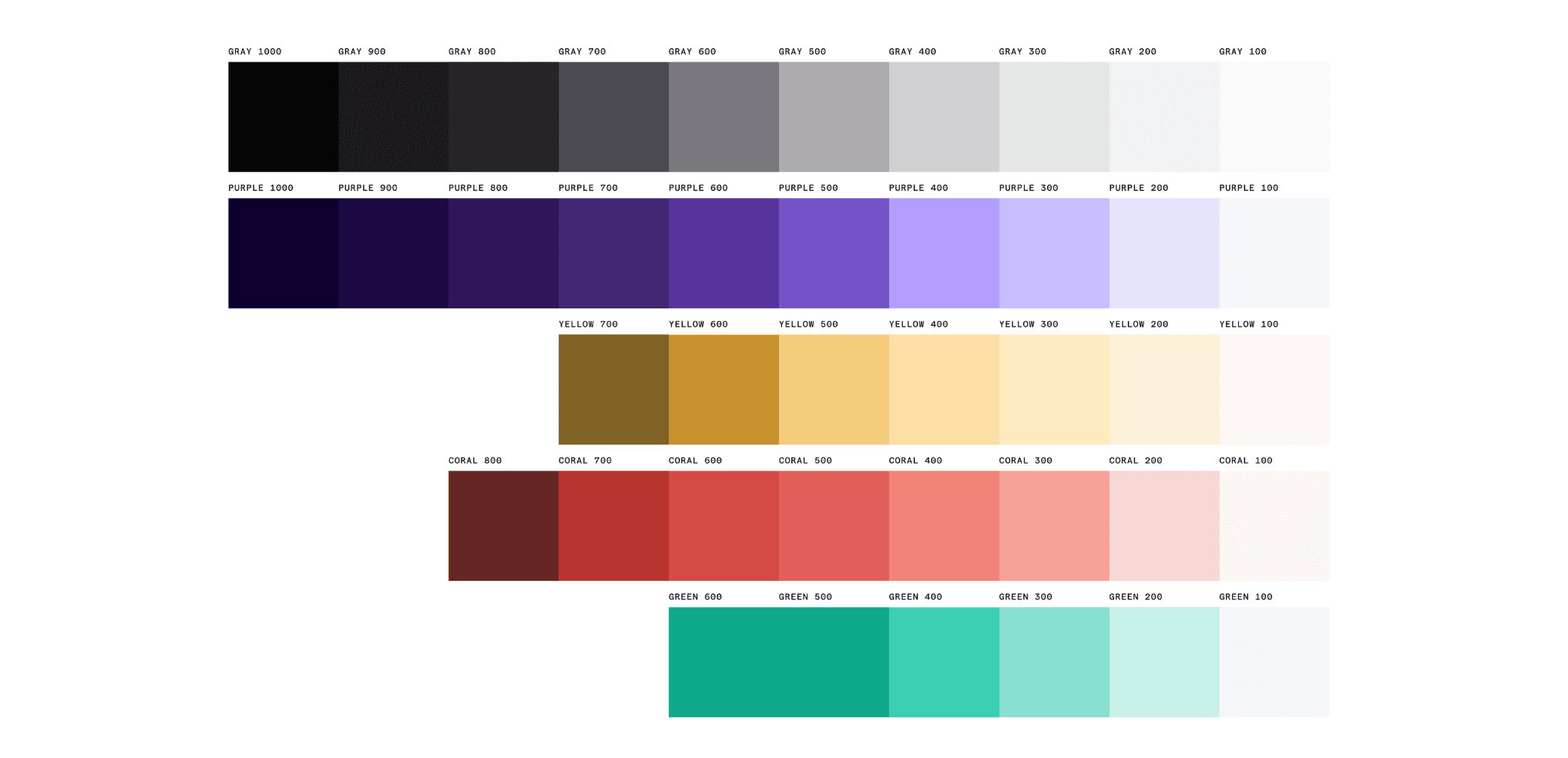
The next major design update will support multiple color schemes, including dark mode, accessibility modes, and custom brand palettes.
In addition to improving the visuals, we wanted to prioritize accessibility for this update. We asked ourselves questions such as:
- Does the dashboard meet certain contrast requirements?
- Is the type size large enough?
- Do we meet the basic requirements for Web accessibility standards?
Going forward, accessibility will be a big focus where we’ll look at every single component, layout and view to ensure it complies with accessibility standards. For now, the dashboard will remain the same, structurally and functionally.
Why update the dashboard, anyway?
Swell was originally aimed squarely at developers who wanted an API-first commerce backend that was highly customizable, and the admin dashboard reflected that. Just about everything was configurable, but the tradeoff was that when you created a store, you had to figure out how the UI should be set up.
Over time, we realized that the majority of people preferred a dashboard that was ready to use as soon as they spun up a store, rather than total control. This prompted a rethink of how the dashboard should work, and a rebrand of the entire product.
We’ve always believed that good design leads to good products, and good products leads to good business. We want the best possible product for our users, so we take the time to go back and fix things rather than just adding new features all the time. We believe this is what separates us from competitors.
“We’ve always believed that good design leads to good products, and good products leads to good business”
Too often, companies just look to the next feature they can build. At Swell, we care about the experience that our current customers have on the platform and how we can make it easier for them.
Why is design important for Swell as an ecommerce platform?
Swell was built to support the kind of complex commerce requirements that would otherwise require a fully custom backend to be built from scratch.
Our ultimate goal is to support this incredible level of flexibility while also providing an uncomplicated dashboard for admins and operations folks to use every day.
That’s only possible if we design with a variety of use cases in mind, and pay attention to the details.
Want to explore the new Swell dashboard? Try 14 days free and start building your store today. Get started here.